Spring waits for no one, it is a life force, and it is here. Walking with our families through our neighborhoods, a patch of yellow daffodils catches our eye. Cherry blossom petals fall like snow, collecting in the edges of concrete sidewalks and framing them in pink. Our hands are in the rich dark dirt, planting and tending garden with the goal of greening things up.
A deep inhale of freshly cut grass instantly ushers in a sense of health, wellbeing, and simpler pleasures. In the Northern hemisphere, Spring brings us longer days, more sunlight, and an almost instinctual urge to clean—to make things sparkle.
Green is the color of spring and the mood it carries is change, abundance, and hope. Green is our physically fortifying mixed salad; it is our financial success in the form of the dollar. Pick a four-leaf clover for good luck. In these luminous April days, we long to breathe and stretch like all growing things do, in the fresh air, toward the sun.
An understanding of the draw and power of light and color to alter our moods is not new. From the cave dwellers of Lascaux, who are thought to have begun mining solely for the purpose of obtaining rare iron earth pigments to embellish their art, to the Egyptians of 2200 BC fashioning sacred items from Lapis Lazuli, to Feng Shui masters channeling the spiritual realm through purple (and cautioning our overuse of it), the human psyche and soul is fascinated and regulated by how light reflects off a surface to deliver to us, more or less, the rainbow.
Those of us who are designers are in the business of playing with color and bringing light into our clients’ homes try to figure out first and foremost, how a family and the individuals in it want to express themselves. An exquisitely thought out color scheme pleases the eye, but beyond aesthetics, color supports our personality and compliments our mood. Attention to natural light and the way it moves through each room of a home throughout the day can inform our color selection, furniture layout, and biophiliac instincts.
Colors
The colors we choose for each room of our home must help us achieve the comfort we want to feel at home. Where does generating an atmosphere of harmony make sense? Where is a boost of creativity a boon? How can we induce calm and restoration? Which spaces need to provide a sense of hygiene and safety, and what soothing or bright colors are we simply drawn to?
Textile artist and color expert, Lori Weitzner, offers a quick online Ode to Color Analysis that suggests what Color Worlds might best suit and feed our souls. I love what she says around the 1:12 mark in Chaise Lounge podcast #248 about the sacredness of our interior spaces and how we “create them and create in them.”
Many of us innately sense that reds and pinks are pretty, passionate, feminine, and festive. Purple, as Prince knew, is royal and sexy. Pairing complementary colors, such as blue and yellow is an instant refresher. Grays, neutral whites, browns, and many greens are grounding and go well with most other colors. We often find those subtle tones in Scandinavian and minimalist interiors.
But beyond the superficial palette, we want to consider the deeper purpose of each space. The color we paint the walls and the furniture we select matters. select furniture, items to accessories that surround us matters. The hues with which we upholster our furniture and accessorize a room set the tone for comfort and interaction. The color of a backsplash, of countertops, and of floors and ceilings feeds the spirit.
Where we spend time in our homes and how we spend it inform color scheme, and likewise, the color scheme we choose—literally—colors our moods.
Kitchen
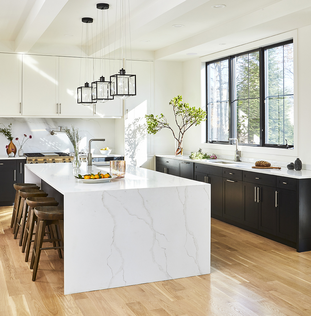
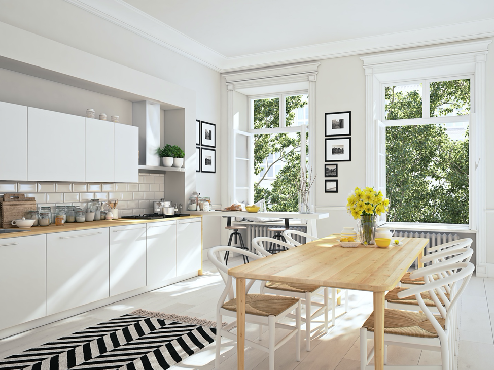
We wake up and kickstart our day in the kitchen. Our family meets here for nourishment. A white-dominant kitchen allows everyone to start their day anew with a blank slate and all possibility laid out ahead of them. The kitchen as a central hub must feel and be kept sanitized, and the color white achieves this effect. But clean and pure does not need to translate to cold and devoid of life. Add texture and materiality with countertops that reflect the light flooding in from a set of windows. Toss a little color in with tile, painted cabinets, exquisite hardware, and a shelf to display those vibrant plates you bought in Portugal.
Or use Europe as your inspiration. The cobblestone streets in France and Italy exude an earthiness you can almost wrap your toes around. Terracotta, with its soft orange, faded yellow, and clay white tones, slows time. Good food, shared meals, and an appreciation for family and tradition live in this muted palette.
Workspace
Working from home is an opportunity to reimagine time and all that fuels us. Once we have carved away the square footage, what will motivate us to stay creative, focused, and productive? Natural light keeps us alert and inspired, so whenever possible, position your desk and computer where there is no glare, and get busy.
Setting up and settling into your new office space, remember that just as some people can work surrounded by others talking or music blasting and others cannot, your home office color scheme might vary wildly from that of your virtual colleagues. Neutral tones of grey and white feel sophisticated and classic, whereas a blast of yellow, gold, or orange spurs the visionary and artist inside us. Blue, the color of water, keeps us clearheaded and in the flow; whereas a light green puts us in a near-Spring state year-round—always blooming.
Bedroom
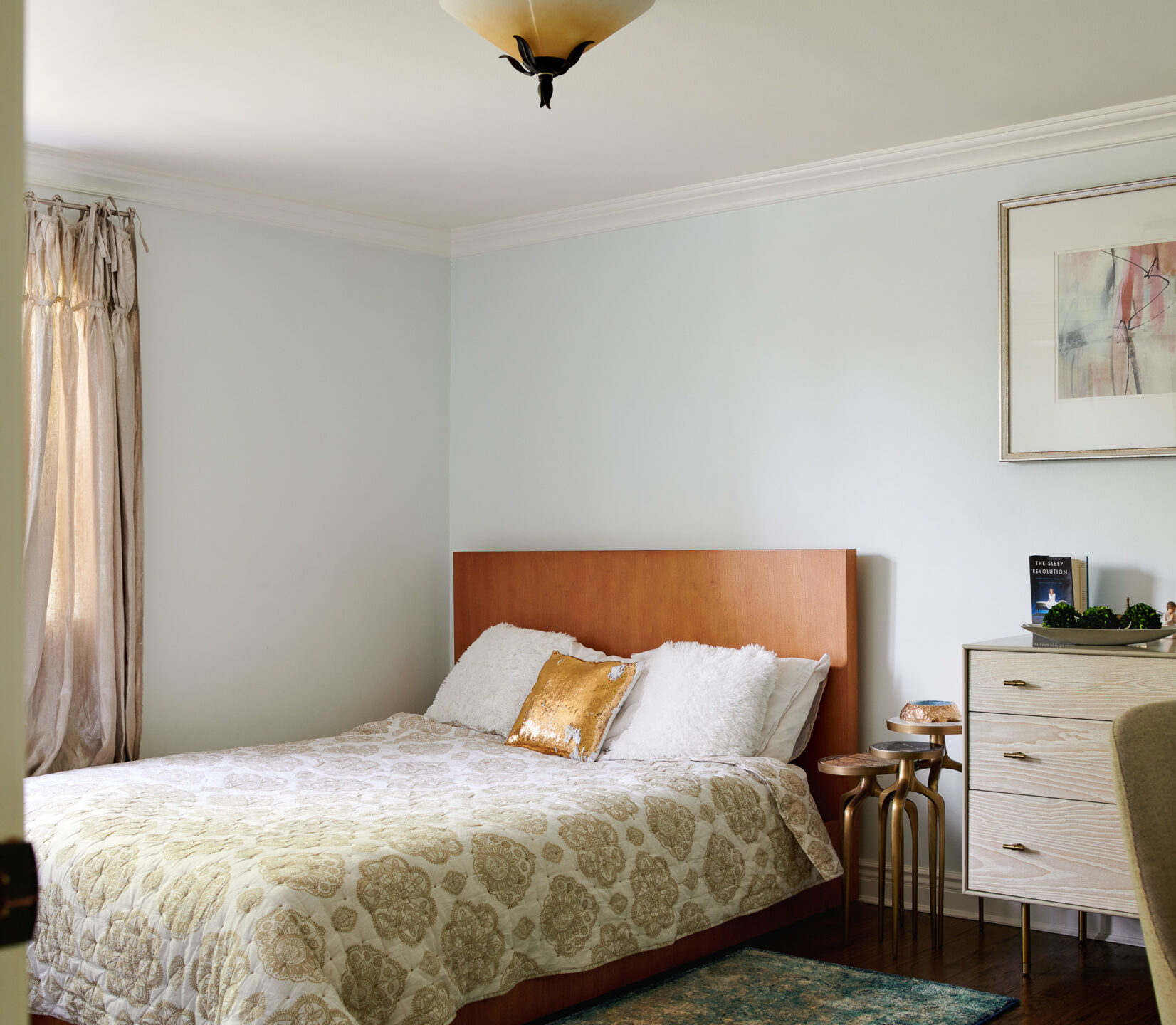
And then there is the end of the day, and whatever our hours have consisted of and dealt us, we need to turn in and recover. Choose window treatments that mesh with your circadian rhythm and add to an ambiance of relaxation. Any color can work in the bedroom—a light grey, creamy peach, gentle lavender, or powder blue—as long as it is soft and hushed.
The truth is, any color can work anywhere. But as we walk through our home, we should have a sense that our space is integrated and integral, and that in each room, we feel whole, well, comforted, and connected.
If you are seeking more personalized input on “spring cleaning” your home with a freshened-up color scheme, get in touch here and let’s talk through all your rooms and all that is possible. The sky is the limit, and I’m here to help bring in more light and comfort.
